Chart Report Sample Answer
Chart Report Title: The People Immigrating To The UK From 2000 To 2008
Keywords or Topics: immigrating
The samples about "The people immigrating to the UK from 2000 to 2008" are handy resources for students to enrich their writing skills of chart report.
Besides, more chart report questions sharing the topic of "immigrating" are added to help students understand the different requirements and target the assignments precisely.
| Actions & New chart report examples |
| Chart questions and samples |
Question:
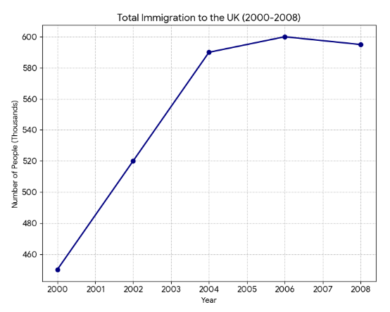
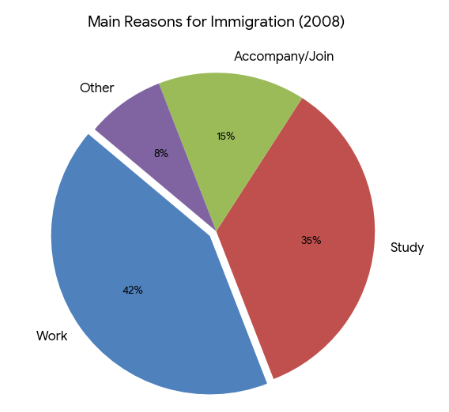
The line graph illustrates the total number of people immigrating to the UK from 2000 to 2008, while the pie chart breaks down the reasons for immigration in the final year of that period.
Summarize the information by selecting and reporting the main features, and make comparisons where relevant.
Write at least 150 words.
Summarize the information by selecting and reporting the main features, and make comparisons where relevant.
Write at least 150 words.
Answer 1
The provided line graph tracks the total influx of immigrants to the UK over an eight-year period starting in 2000, while the pie chart categorizes their primary motivations for moving in 2008...
Overall, the UK experienced a significant and steady rise in immigration levels until 2006, after which the figures stabilized...
In 2000, immigration to the UK stood at 450,000 people. This figure grew consistently over the next six years, peaking at 600,000 in 2006...
When examining the motivations for 2008, work was the primary driver, accounting for 42% of all immigrants...
Band: 7.5
Word Statistics
| Group | Word Number | Distinct | Percent |
|---|---|---|---|
| All Words | 181 | 110 | 60% |
| Top 300 Words | 76 (41%) | 30 (27%) | 39% |
| 300 - 1000 Words | 37 (20%) | 31 (28%) | 83% |
| Over 1000 Words | 68 (37%) | 49 (44%) | 72% |
Other Comments (jeepsondosey)
Link Words: 4 (including link phrase: 0)
Sentences: Number: 10; Average Length: 111 characters; Words/Sentence: 18
Repeated Words: for(6), 2008(4), immigration(3), over(3), all(3), total(2), 2000(2)