Chart Report Sample Answer
Chart Report Title: The Percentage Of Students Enrolled In Different Courses
Keywords or Topics: university
The samples about "The percentage of students enrolled in different courses" are handy resources for students to enrich their writing skills of chart report.
Besides, more chart report questions sharing the topic of "university" are added to help students understand the different requirements and target the assignments precisely.
| Actions & New chart report examples |
| Chart questions and samples |
Question:
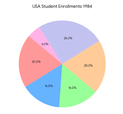
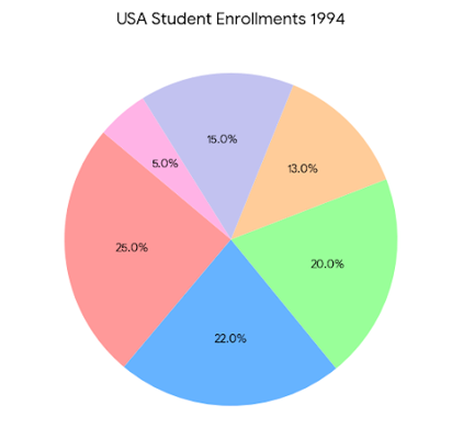
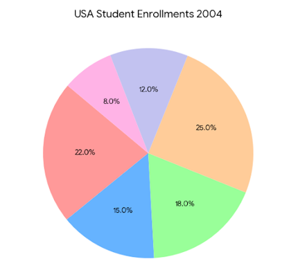
The three pie charts below show the percentage of students enrolled in different courses at a university in the USA in 1984, 1994, and 2004.
Summarize the information by selecting and reporting the main features, and make comparisons where relevant.
Write at least 150 words.
Summarize the information by selecting and reporting the main features, and make comparisons where relevant.
Write at least 150 words.
Answer 1
The pie charts illustrate the changes in student enrollment across six different subjects at a university in the USA between 1984 and 2004...
Overall, the most striking trend was the steady decline in Vocational course enrollments. In contrast, Social Science showed significant growth by the end of the period, while subjects like STEM and Health experienced temporary peaks in 1994 before returning to near-original levels...
In 1984, Vocational studies were the most popular, representing a quarter (25%) of all enrollments...
Humanities remained consistently popular throughout the period, fluctuating slightly between 20% and 25%...
Band: 8
Word Statistics
| Group | Word Number | Distinct | Percent |
|---|---|---|---|
| All Words | 186 | 109 | 58% |
| Top 300 Words | 72 (38%) | 29 (26%) | 40% |
| 300 - 1000 Words | 34 (18%) | 25 (22%) | 73% |
| Over 1000 Words | 80 (43%) | 55 (50%) | 68% |
Other Comments (kimbolan)
Link Words: 14 (including link phrase: 0)
Sentences: Number: 10; Average Length: 116 characters; Words/Sentence: 18
Repeated Words: and(8), 2004(4), 1994(4), subjects(3), most(3), enrollment(2), between(2)
Chart Report Questions for Topic : university
Samples
2. The different methods of transportation used by UK university students
Samples