2026 IELTS Academic Writing Task 1 (Chart) With Answers
IELTS Practice List
IELTS Writing Test
General Training Writing Task 1 Topics
General Training Writing Task 2 Topics
Academic Writing Task 1 Topics
Academic Writing Task 2 Topics
2026 IELTS Academic Writing Task 1 (Chart) With ...
2026 IELTS General Writing Task 1 (Letter) With ...
2026 IELTS Writing Task 2 (Essay) Questions With ...
General Training Writing Task 1 Topics
General Training Writing Task 2 Topics
Academic Writing Task 1 Topics
Academic Writing Task 2 Topics
2026 IELTS Academic Writing Task 1 (Chart) With ...
2026 IELTS General Writing Task 1 (Letter) With ...
2026 IELTS Writing Task 2 (Essay) Questions With ...
By Pacific Lava
2026 IELTS Academic Writing Task 1 (Chart) With Answers
We collect recent IELTS Academic Writing Task 1 (Chart and Table) questions from test-takers and other public sources, and present them here. They aren't exact questions from any test and are intended only to help candidates understand test scenarios more deeply.
This page includes 25 chart and table questions for the academic writing task 1. These questions are excellent practice for the IELTS test and provide valuable clues and ideas for preparing for other similar topics. We have provided answers to all questions.
This page includes 25 chart and table questions for the academic writing task 1. These questions are excellent practice for the IELTS test and provide valuable clues and ideas for preparing for other similar topics. We have provided answers to all questions.
1. Recent Chart and Table Questions
2026-05-16: Chart ReportNo. 1
The table and line charts below compare international tourist arrivals and revenue for four East Asian countries from 2000 to 2014.
Summarize the information by selecting and reporting the main features and making comparisons where relevant.
Write at least 150 words.
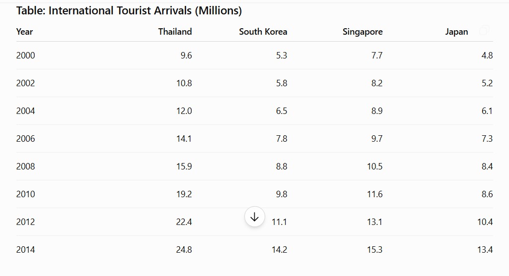
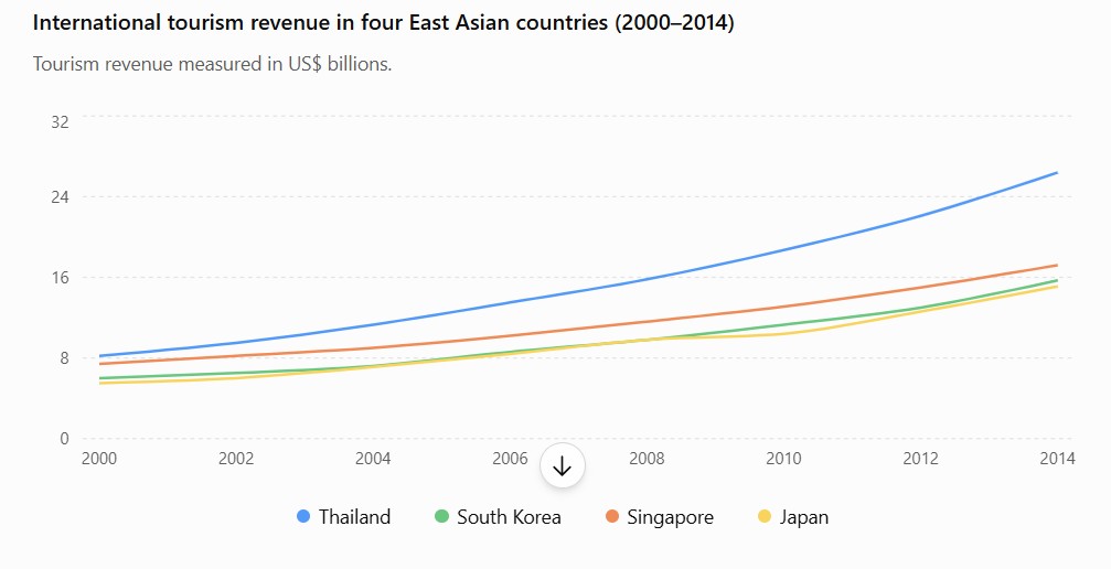
Keywords: tourist
Type: table; line
Summarize the information by selecting and reporting the main features and making comparisons where relevant.
Write at least 150 words.
Keywords: tourist
Type: table; line
2026-05-09: Chart ReportNo. 2
The pie charts below show the proportions of residential water usage for different purposes in 1980 and 2008.
Summarize the information by selecting and reporting the main features and making comparisons where relevant.
Write at least 150 words.
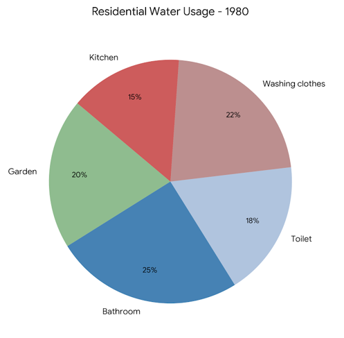
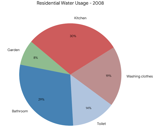
Keywords: rent
Type: pie
Summarize the information by selecting and reporting the main features and making comparisons where relevant.
Write at least 150 words.
Keywords: rent
Type: pie
2026-04-24: Chart ReportNo. 3
The bar charts show average weekly rents for houses and apartments in four Australian cities in 2016 and 2017.
Summarize the information by selecting and reporting the main features and making comparisons where relevant.
Write at least 150 words.
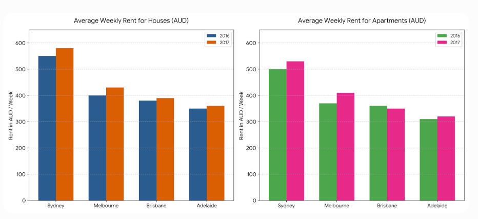
Keywords: rent
Type: bar
Summarize the information by selecting and reporting the main features and making comparisons where relevant.
Write at least 150 words.
Keywords: rent
Type: bar
2026-04-18: Chart ReportNo. 4
The tables illustrate the three different countries from which international students in Canada and the United States came in March 2002 and April 2004, and the percentage changes in those countries.
Summarize the information by selecting and reporting the main features and making comparisons where relevant.
Write at least 150 words.
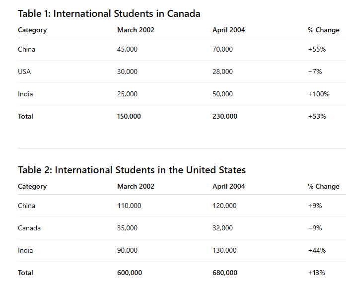
Keywords: student
Type: table
Summarize the information by selecting and reporting the main features and making comparisons where relevant.
Write at least 150 words.
Keywords: student
Type: table
2026-04-11: Chart ReportNo. 5
The bar chart below shows the proportions of Australians in five different age groups who owned their own homes in 1981, 1991, 2001, and 2011.
Summarize the information by selecting and reporting the main features and making comparisons where relevant.
Write at least 150 words.
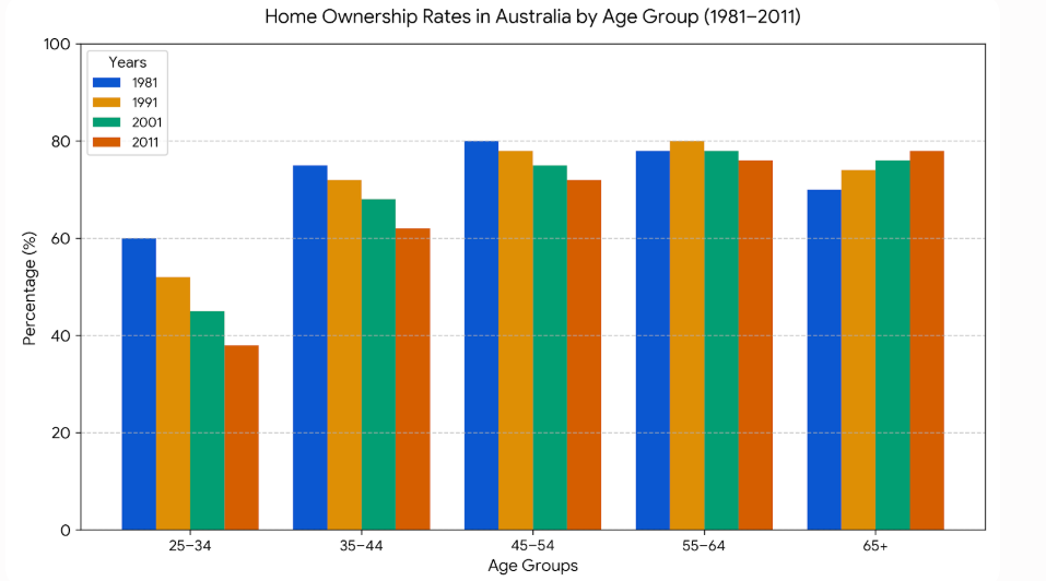
Keywords: age
Type: bar
Summarize the information by selecting and reporting the main features and making comparisons where relevant.
Write at least 150 words.
Keywords: age
Type: bar
2026-03-28: Chart ReportNo. 6
The table and graph below give information about Internet searches in US between 2004 and 2010.
Summarize the information by selecting and reporting the main features and making comparisons where relevant.
Write at least 150 words.
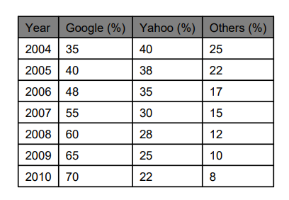
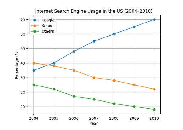
Keywords: internet
Type: table; line
Summarize the information by selecting and reporting the main features and making comparisons where relevant.
Write at least 150 words.
Keywords: internet
Type: table; line
2026-03-21: Chart ReportNo. 7
The bar chart shows the number of five different types of non-medical staff employed at a clinic in the UK between 2000 and 2015.
Summarize the information by selecting and reporting the main features and making comparisons where relevant.
Write at least 150 words.
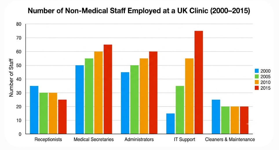
Keywords: employment
Type: bar
Summarize the information by selecting and reporting the main features and making comparisons where relevant.
Write at least 150 words.
Keywords: employment
Type: bar
2026-02-28: Chart ReportNo. 8
The chart below shows waste disposal in one European country over four years: 2005, 2006, 2007, and 2008.
Summarize the information by selecting and reporting the main features and make comparisons where relevant.
Write at least 150 words.
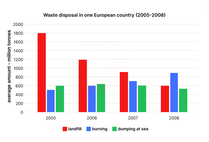
Keywords: recycling; environment
Type: bar
Summarize the information by selecting and reporting the main features and make comparisons where relevant.
Write at least 150 words.
Keywords: recycling; environment
Type: bar
2026-01-31: Chart ReportNo. 9
The table compares changes in tourism in Australia at three different time points.
Summarize the information by selecting and reporting the main features and making comparisons where relevant.
Write at least 150 words.
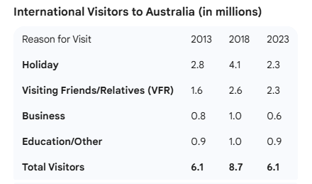
Keywords: tour
Type: table
Summarize the information by selecting and reporting the main features and making comparisons where relevant.
Write at least 150 words.
Keywords: tour
Type: table
2026-01-24: Chart ReportNo. 10
The bar chart below shows the percentage of people in five different age groups who prefer four specific genres of music.
Summarize the information by selecting and reporting the main features, and make comparisons where relevant.
Write at least 150 words.
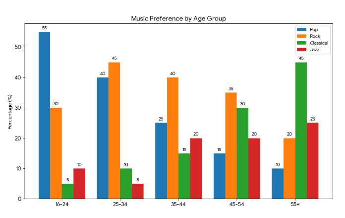
Keywords: music
Type: bar
Summarize the information by selecting and reporting the main features, and make comparisons where relevant.
Write at least 150 words.
Keywords: music
Type: bar
2026-01-10: Chart ReportNo. 11
The pie charts show the purposes of passengers (visiting friends, holiday, business, other) flying from four airports in the UK in 2016.
Summarize the information by selecting and reporting the main features and make comparisons where relevant.
Write at least 150 words.
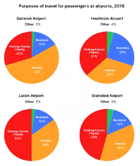
Keywords: travel
Type: pie
Summarize the information by selecting and reporting the main features and make comparisons where relevant.
Write at least 150 words.
Keywords: travel
Type: pie
2025-12-20: Chart ReportNo. 12
The diagram below shows the process for recycling plastic bottles.
Summarize the information by selecting and reporting the main features and make comparisons where relevant.
Write at least 150 words.
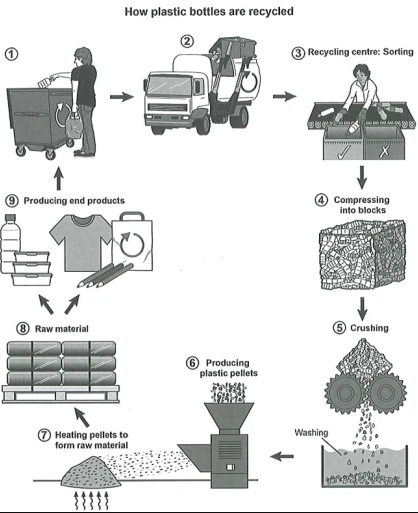
Keywords: process
Type: chart
Summarize the information by selecting and reporting the main features and make comparisons where relevant.
Write at least 150 words.
Keywords: process
Type: chart
2025-12-13: Chart ReportNo. 13
The line graph below gives information about the percentage of women aged 15-64 in employment between 2003 and 2009.
Summarize the information by selecting and reporting the main features and make comparisons where relevant.
Write at least 150 words.
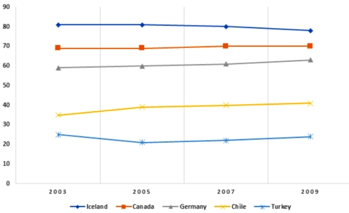
Keywords: employment; woman
Type: line
Summarize the information by selecting and reporting the main features and make comparisons where relevant.
Write at least 150 words.
Keywords: employment; woman
Type: line
2025-12-06: Chart ReportNo. 14
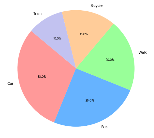
The two pie charts below show the different methods of transportation used by UK university students to travel to school in 2015 and 2019.
Summarize the information by selecting and reporting the main features and make comparisons where relevant.
Write at least 150 words.
Transportation Methods 2015
 Transportation Methods 2019
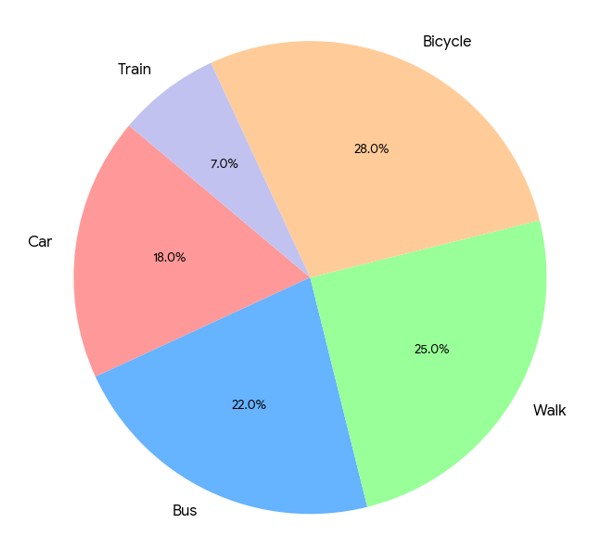
Keywords: transport; university
Type: pie
Summarize the information by selecting and reporting the main features and make comparisons where relevant.
Write at least 150 words.
Transportation Methods 2015
Transportation Methods 2019Keywords: transport; university
Type: pie
2025-11-22: Chart ReportNo. 15
The maps show the layouts of two kitchens.
Summarize the information by selecting and reporting the main features and make comparisons where relevant.
Write at least 150 words.
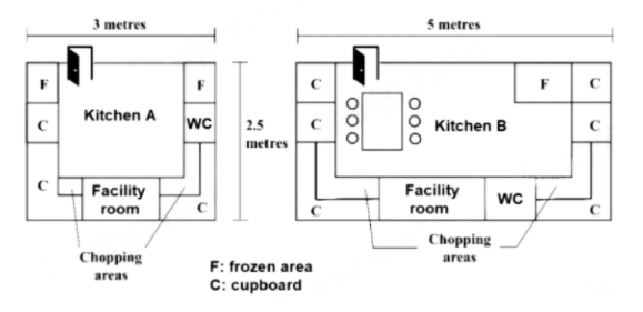
Keywords: home
Type: map
Summarize the information by selecting and reporting the main features and make comparisons where relevant.
Write at least 150 words.
Keywords: home
Type: map
2025-11-01: Chart ReportNo. 16
The bar chart below shows the percentage of trips made by different means of transport (Walking, Bus, and Car) for four various purposes in the UK in 2013.
Summarize the information by selecting and reporting the main features and make comparisons where relevant.
Write at least 150 words.
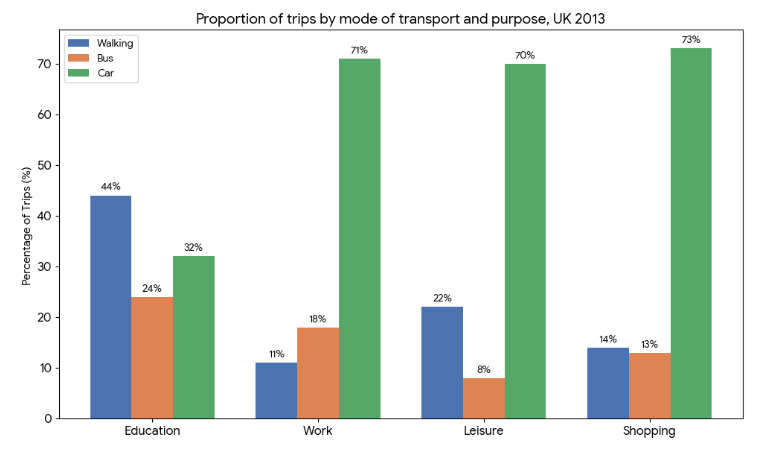
Keywords: transport
Type: bar
Summarize the information by selecting and reporting the main features and make comparisons where relevant.
Write at least 150 words.
Keywords: transport
Type: bar
2025-11-01: Chart ReportNo. 17
The charts below show the percentage of people using public transport and that of people using private cars in five Australian cities between 2000 and 2010.
Summarize the information by selecting and reporting the main features and make comparisons where relevant.
Write at least 150 words.
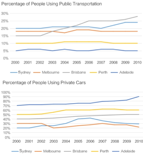
Keywords: transport
Type: line
Summarize the information by selecting and reporting the main features and make comparisons where relevant.
Write at least 150 words.
Keywords: transport
Type: line
2025-10-25: Chart ReportNo. 18
The bar chart below shows the percentage of the population living in the two largest cities compared to other cities in seven different countries in 2017.
Summarize the information by selecting and reporting the main features and make comparisons where relevant.
Write at least 150 words.
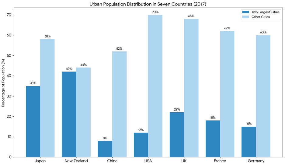
Keywords: population
Type: bar
Summarize the information by selecting and reporting the main features and make comparisons where relevant.
Write at least 150 words.
Keywords: population
Type: bar
2025-10-11: Chart ReportNo. 19
The line graphs below show the number of hospital beds per 1,000 people and the percentage of patients waiting more than one month for elective surgery in five different countries between 2010 and 2018.
Summarize the information by selecting and reporting the main features and make comparisons where relevant.
Write at least 150 words.
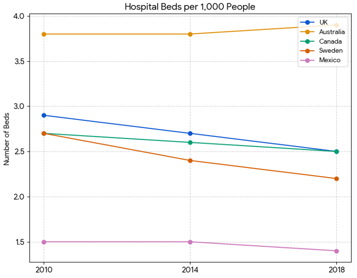
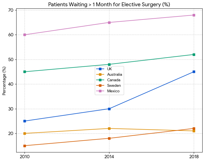
Keywords: hospital
Type: line
Summarize the information by selecting and reporting the main features and make comparisons where relevant.
Write at least 150 words.
Keywords: hospital
Type: line
2025-09-27: Chart ReportNo. 20
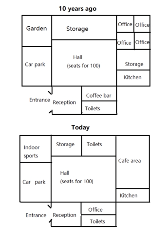
The maps below show a community center 10 years ago and the same center today.
Summarize the information by selecting and reporting the main features and make comparisons where relevant.
Write at least 150 words.
Keywords: building
Type: map
Summarize the information by selecting and reporting the main features and make comparisons where relevant.
Write at least 150 words.
Keywords: building
Type: map
2025-09-13: Chart ReportNo. 21
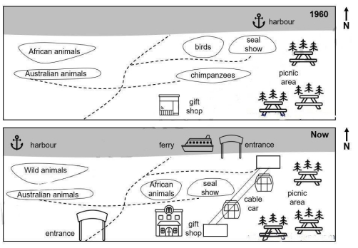
The maps show the changes that have taken place at an Australian Zoo between 1960 and now.
Summarize the information by selecting and reporting the main features and make comparisons where relevant.
Write at least 150 words.
Keywords: zoo
Type: map
Summarize the information by selecting and reporting the main features and make comparisons where relevant.
Write at least 150 words.
Keywords: zoo
Type: map
2025-08-30: Chart ReportNo. 22
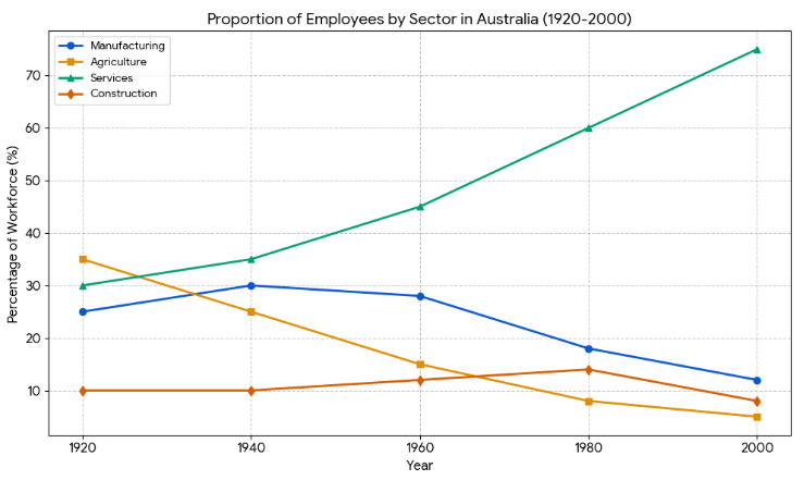
The line graph below shows the changes in the proportion of the Australian workforce employed in four different sectors from 1920 to 2000.
Summarize the information by selecting and reporting the main features, and make comparisons where relevant.
Write at least 150 words.
Keywords: job
Type: line
Summarize the information by selecting and reporting the main features, and make comparisons where relevant.
Write at least 150 words.
Keywords: job
Type: line
2025-08-23: Chart ReportNo. 23
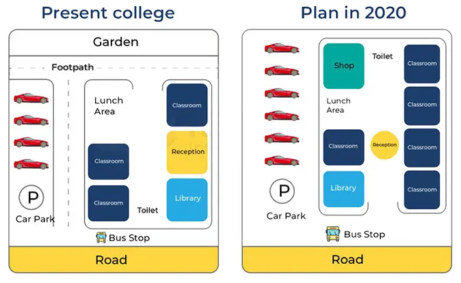
The diagrams below show the present building of a college and the plan for changes to the college site in the future.
Summarize the information by selecting and reporting the main features, and make comparisons where relevant.
Write at least 150 words.
Keywords: building
Type: map
Summarize the information by selecting and reporting the main features, and make comparisons where relevant.
Write at least 150 words.
Keywords: building
Type: map
2025-08-16: Chart ReportNo. 24
The bar charts below show the information about the population in a particular town in the UK from 1951 to 2011.
Summarize the information by selecting and reporting the main features, and make comparisons where relevant.
Write at least 150 words.
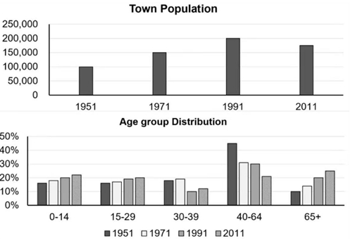
Keywords: population
Type: bar
Summarize the information by selecting and reporting the main features, and make comparisons where relevant.
Write at least 150 words.
Keywords: population
Type: bar
2025-08-09: Chart ReportNo. 25
The diagram below shows a possible future means of home energy production from methane.
Summarize the information by selecting and reporting the main features, and make comparisons where relevant.
Write at least 150 words.
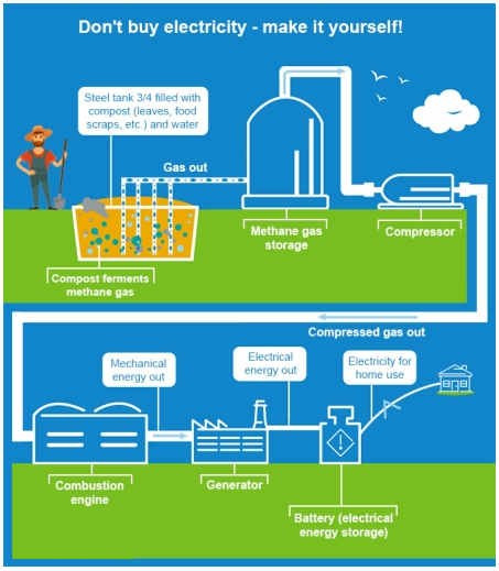
Keywords: energy
Type: chart
Summarize the information by selecting and reporting the main features, and make comparisons where relevant.
Write at least 150 words.
Keywords: energy
Type: chart
2. More Sample Questions
This page only shows the latest 25 questions; please search early questions there:Learn structure and more questions by topics of IELTS Academic writing :
Other Resources for IELTS Academic Writing
IELTS academic writing samples :
Questions of other IELTS Academic test sections :